
Creative Specs for Performance Campaigns: What Brand-Conscious Businesses Should Supply, and Why it Matters

On Google, Meta, Pinterest and TikTok, an ad asset is rarely used in just one fixed format.
A single image or video might be resized, paired with different copy, shown in different placements, used across feeds, Stories, Reels, Shorts, Display, Discover and search-adjacent surfaces, or left out of placements it is not suitable for.
That is why creative specifications matter before a campaign goes live.
The issue is not simply that platforms will automatically crop assets badly. Sometimes they may adapt, resize or reframe an asset in a way that weakens the original composition. In other cases, the asset may not be eligible or suitable for the placements where it could have delivered useful reach. Both outcomes create a problem: the campaign has less control, less coverage and less reliable creative learning from the start.
For brand-conscious businesses — fashion, beauty, lifestyle, retail, interiors, hospitality, wellness, education, B2B or services — this is not just a technical media-buying detail. It affects how the brand is seen.
A product can look premium on the website and careless in a poorly framed ad. A service business can lose credibility if the person, result or proof point is hidden. A lifestyle brand can lose its atmosphere if the visual is forced into a format it was never designed for.
The avoidable problems are usually familiar: cropped-out products, cut-off faces, misplaced logos, blurry previews, weak first frames, UI-covered text, reduced placement coverage and assets being stretched into jobs they were never built to do.
At Bravada, creative briefing is purposeful and considered. Campaign theme, budget, success metrics, visual assets, copy, launch dates, destination URLs and relevant whitelists all sit inside the briefing process.
Performance creative is campaign infrastructure. It gives the platforms enough to work with, while keeping the brand visually controlled across the places where the campaign appears.
The goal is not to create more assets for the sake of it. The goal is to supply enough formats for the platforms to optimise, enough variation to understand what works, and enough brand discipline to make sure the creative still looks like the business it represents.
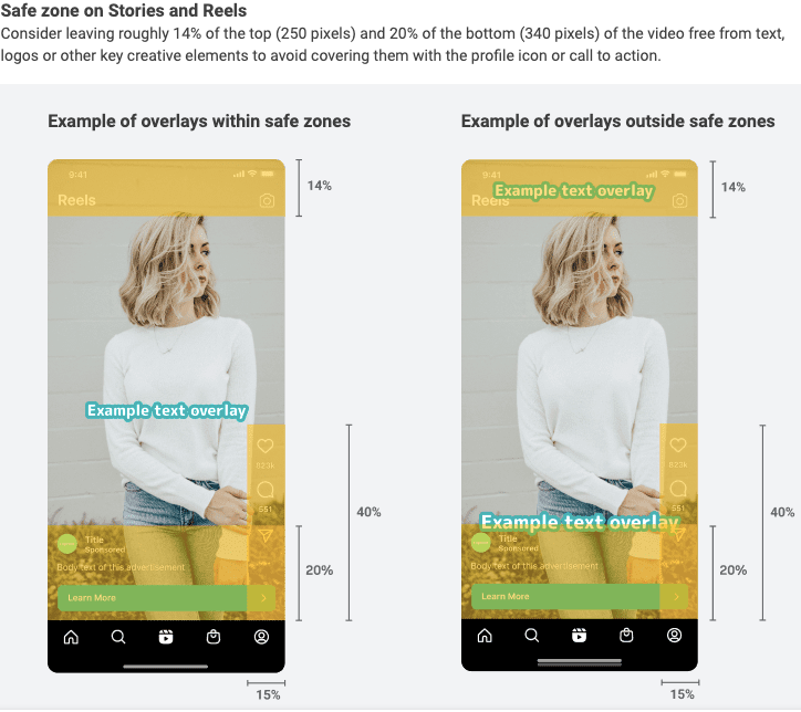
UI-Safe Overlay Placements:
Before diving into asset quantities and specs, one of the key elements often overlooked is guardrails for creative assets. Assets with logos carefully Ddesigned and overlaid into the most aesthetic position can be wasted when viewed through the UI of a social media app. To avoid your brand name, collaboration text, product name, or text overlays being hidden, use the below image as a reference when providing assets with text.
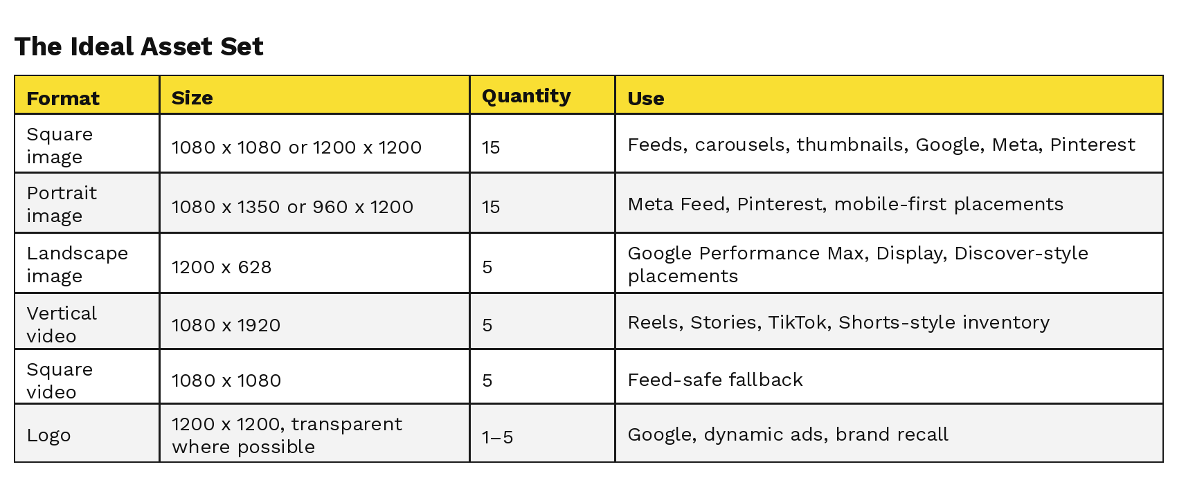
The Ideal Asset Set
For paid launch, supply:
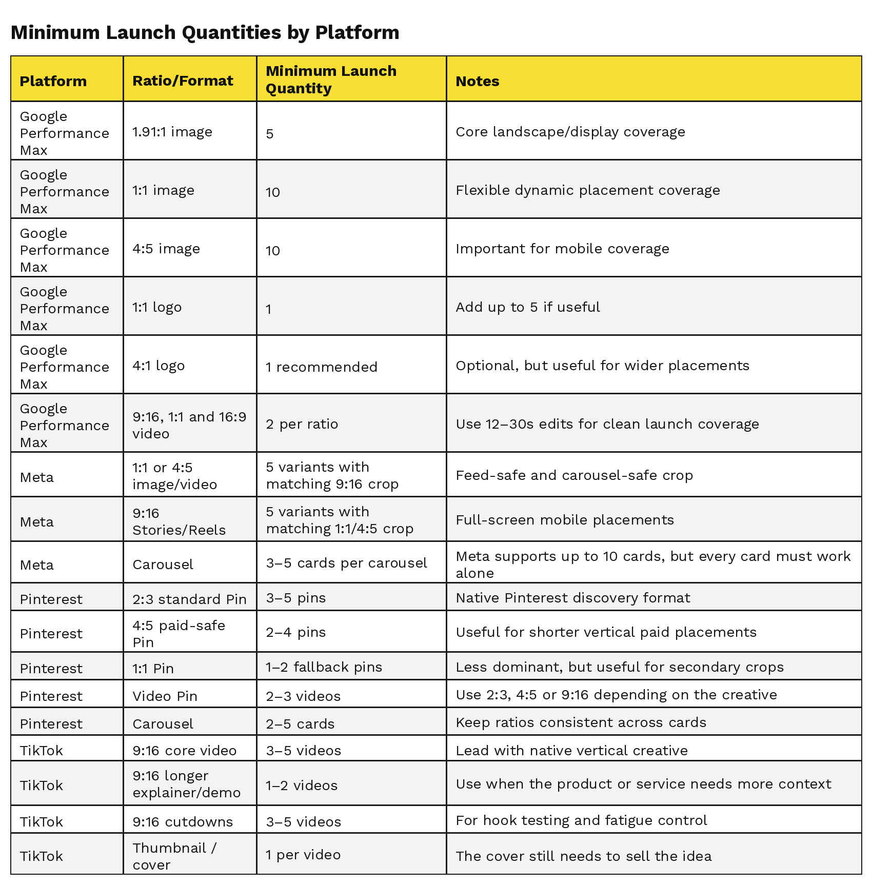
Minimum Launch Quantities by Platform
The quantities below are a practical launch minimum. They are designed to cover key placements, reduce poor formatting, and give the algorithm enough variation to test without flooding the campaign with weak or repetitive creative.
The Real Risk: Adaptation or Reduced Coverage
When the right ratios are missing, platforms usually have two broad options.
They can adapt the asset. That might mean resizing it, reframing it, using a weaker preview or placing it somewhere the original composition no longer works as intended.
Or they can limit where the asset serves. In that case, the campaign may lose access to useful placements, reducing visibility and narrowing the data the platform can learn from.
Neither outcome is ideal, because both mean the campaign is working around creative limitations rather than testing the strongest possible version of the idea.
This is why platform-specific crops matter. They are not just a production preference. They help protect both the media opportunity and the brand presentation.
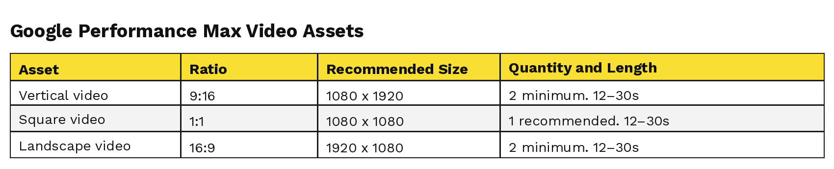
Google Performance Max Creative Specs
Performance Max serves across Google inventory, so creative needs to work across Search-adjacent placements, Shopping, Display, YouTube, Discover and Gmail-style placements.
PMax can combine assets, copy, sitelinks and feed data. That means every asset needs to make sense on its own, not only as part of the original campaign concept.
Required Image Assets
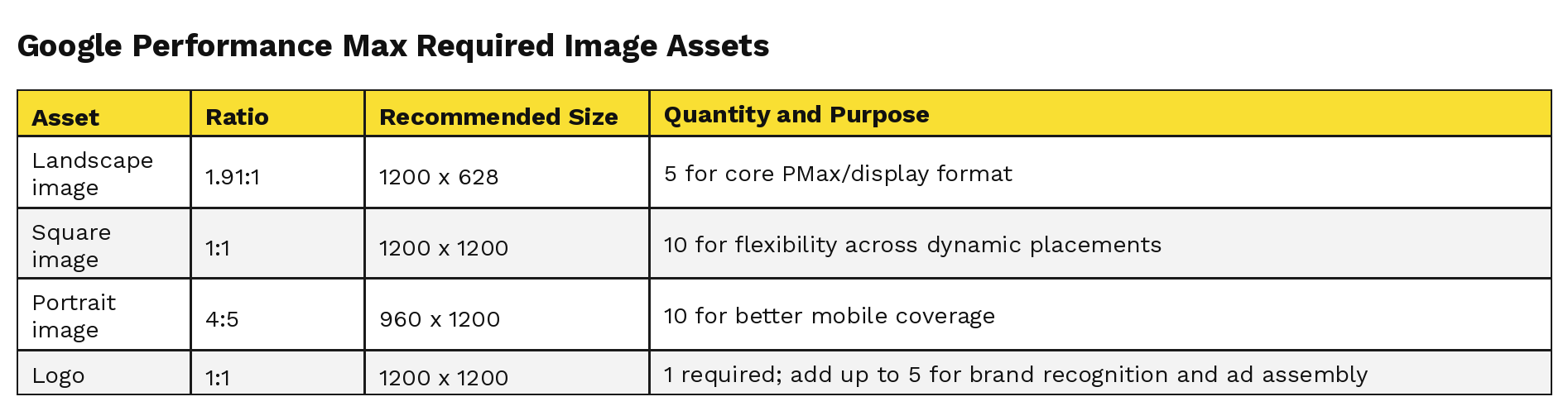
Also supply one horizontal 4:1 logo at 1200 x 300 where available. Google treats it as optional, but it is useful for wider placement coverage.
Video Assets
Creative Direction for PMax
Use clear product, service or proposition-led imagery. PMax needs enough visual information to understand and assemble ads, but the asset still needs to look polished when it is separated from the wider campaign context.
For ecommerce brands, the product should be visible immediately.
For service businesses, the outcome, environment, person, experience or benefit should be clear.
For hospitality, wellness or lifestyle brands, the visual should quickly communicate mood, quality and trust.
Avoid placing logos, faces, product details, text or important service cues at the edges. These are the elements most likely to suffer when an asset is resized or used in a more constrained placement.
For video, make the offer, product, service or experience unmistakable in the first second. For still images, the value should be clear from the crop alone.
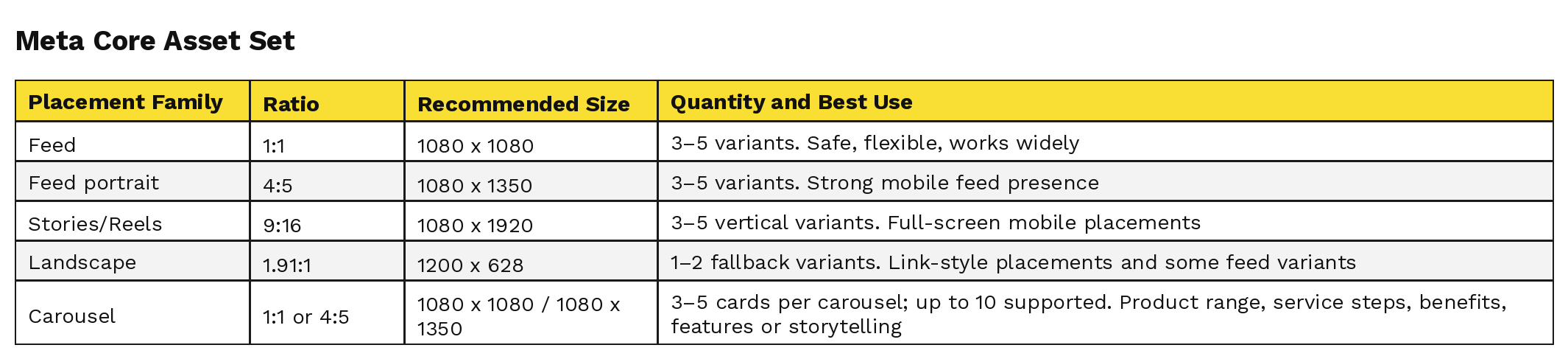
Meta Ads Creative Specs: Covering All Placements
Meta placements include Facebook Feed, Instagram Feed, Stories, Reels, Explore, Marketplace, video feeds, right column and Messenger placements.
For brand-safe delivery, do not rely on one master crop. Build for the main placement families: feed, portrait feed and full-screen vertical.
Meta can adapt creative across placements, but that does not mean every adaptation will protect the brand. Supplying the correct crops gives the campaign more room to serve while keeping the creative intentional.
Core Meta Asset Set
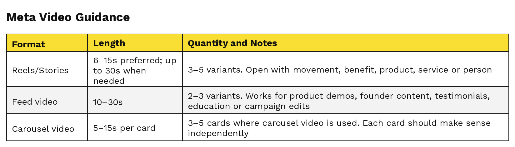
Video Guidance
To run either a video or still asset properly across Meta’s key placement families, provide a feed crop, usually 1:1 or 4:5, and a matching 9:16 Stories/Reels crop.
Composition Rules
Keep key information away from the top and bottom UI zones on Stories and Reels. Logos, faces, product details, captions, pricing, CTAs and important proof points should sit safely within the central frame.
For product brands, crop around the product first.
For service brands, crop around the person, place, process or result.
For hospitality and experience-led brands, make the environment instantly legible.
The goal is not to give Meta one asset and hope it travels well. The goal is to give the system enough properly framed assets that delivery can expand without damaging the brand.
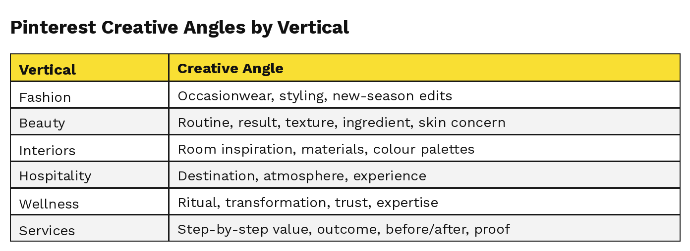
Pinterest Creative Specs
Pinterest is a visual discovery platform. It works particularly well when people are planning, comparing, saving or researching. That can include fashion, beauty, homeware, gifting, interiors, travel, food, wellness, events and lifestyle-led products or services.
Pinterest creative is especially format-sensitive because the asset is judged quickly in a visual feed. Incorrect or poorly considered ratios can weaken the preview, affect how the Pin sits in-feed, or make the asset feel less useful to the user.
Pinterest Asset Set
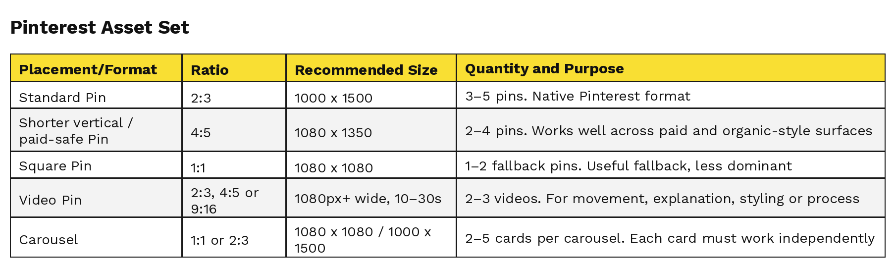
For carousels, the first image matters, but the card a user saves is what appears on their board — so every card needs to be visually strong.
Pinterest Composition Rules
Pinterest creative should feel useful, intentional and saveable. It should answer a need or aspiration.
Avoid generic lifestyle images that look nice but do not explain the product, service or reason to click.
Pinterest rewards assets that look native to the platform and make the reason to save or click immediately clear.
TikTok Creative Specs
TikTok is vertical-first, sound-on, movement-led and fast.
The best creative usually feels native, but native does not have to mean cheap or off-brand. For premium, design-led or trust-led businesses, TikTok should still feel considered.
TikTok can accept some non-vertical formats in certain ad contexts, but the working launch set should prioritise 9:16. Square or landscape assets should be treated as fallback or adaptation assets, not the core creative system.
TikTok Asset Set
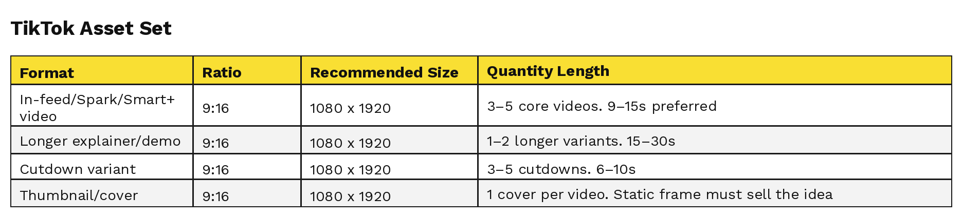
Quantity note: TikTok can accept 1:1 and 16:9 video for some non-Spark auction ads, but the working launch set should prioritise 9:16. Use square or landscape only as fallback/adaptation assets when a specific placement or reuse case requires it.
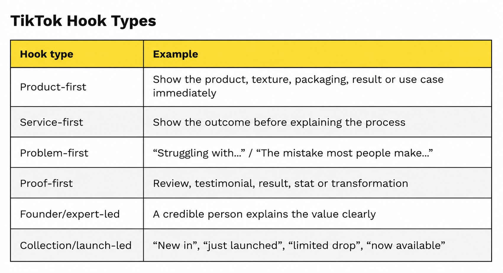
TikTok Hook Rules
The first 1–2 seconds matter. Use one of these:
Keep the brand world intact: good lighting, clear sound, strong framing, controlled editing and no trend-chasing that undermines the business.
Why Creative Diversity Matters
Creative diversity is not about throwing random assets into campaigns. It is about giving the algorithm enough high-quality options to find demand without damaging the brand.
A narrow asset pool limits what the campaign can learn. Different users respond to different visual cues: product, person, result, setting, offer, testimonial, detail, process, lifestyle, expertise or social proof.
It also creates more pressure on each individual asset. If one format is expected to work across too many placements, the campaign becomes more vulnerable to poor adaptation, reduced coverage and creative fatigue.
The Practical Benefits
1. It reduces poor adaptation
When only one crop is supplied, platforms may resize, reframe or preview it in ways it was never designed for. That can cut off products, faces, logos, text, packaging, interiors, service cues or important visual details.
2. It protects placement coverage
When the right formats are missing, the campaign may not be able to serve properly across every useful placement. That can mean less visibility, fewer learning signals and a narrower campaign than planned.
3. It protects brand image
Any brand that cares about perception needs visual control. Proper crops keep the campaign polished across every surface.
4. It improves learning speed
The more structured variation the campaign has, the easier it is to understand what kind of creative is driving response.
5. It supports funnel strategy
Awareness creative should build interest. Consideration creative should educate, reassure or inspire. Conversion creative should make the product, service or next step easy to understand.
6. It reduces creative fatigue
Audiences get bored. Repetition weakens performance and makes a brand feel overexposed. A diverse but controlled creative library keeps campaigns fresh without becoming inconsistent.
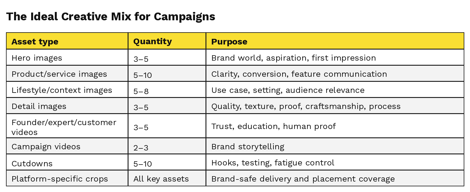
The Ideal Creative Mix for Campaigns
For a new product launch, service push, seasonal campaign or brand awareness campaign, supply:
For brand-conscious businesses, the rule is simple: never hand platforms one beautiful asset and hope they respect it.
Build the asset system around the placements before launch.
Final Pre-Launch Checklist
Before creative goes live:
- Export in RGB, preferably JPG/PNG for images and MP4/MOV for video.
- Use the correct aspect ratios: 1:1, 4:5, 9:16, 1.91:1 and 2:3 where relevant.
- Keep key product, service, face, logo and text details away from crop edges and UI areas.
- Provide clean versions with no embedded text where possible.
- Confirm the minimum asset quantity per ratio before export.
- Check every preview before launch.
- Use platform-specific crops, not one universal crop.
- Make sure each key placement family has a suitable asset, not just a compromised adaptation.
- Keep the brand guide intact: colour, typography, styling, lighting, retouching and tone.
- Refresh creative before performance drops, not after the campaign has gone stale.